Dia Care Club · India · May–Dec 2024
A care service that has to be correct when it says nothing.
Most diabetes apps are built for people who like apps. This one is for a 58-year-old who tests twice a week, doesn’t trust the last lab report, and will read silence from the system as good news. That single constraint — no reading is not the same as a normal reading — drives the whole design.
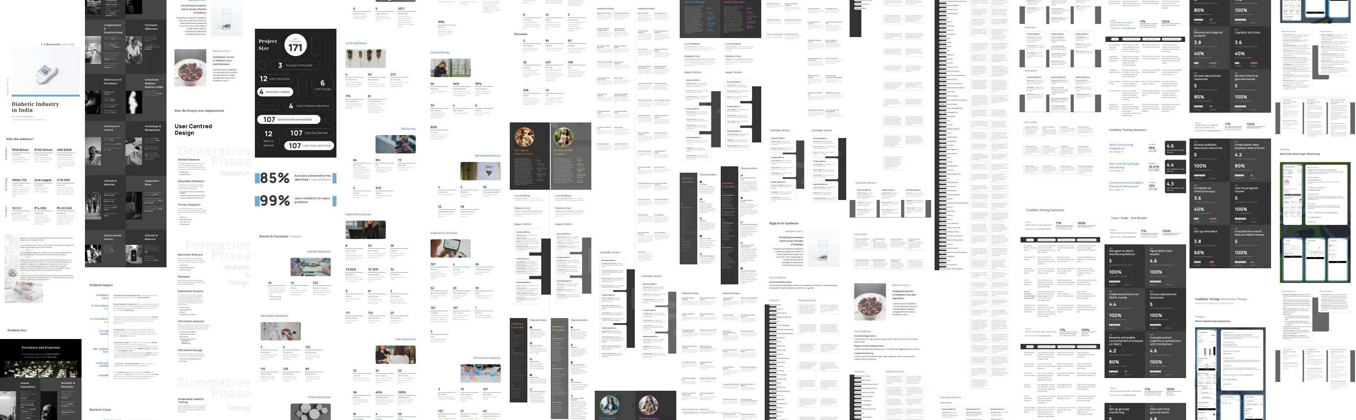
The research board in full — a single 49,252 pt document, cut into sixteen columns and laid side by side. Not meant to be read here.
Research execution synopsis · 2024The problem
Access is the constraint. Not motivation.
India has the world’s second-largest diabetic population, and the standard product response is a tracker with streaks and a leaderboard. The research said something else: people mostly know what they should do. What they don’t have is a reliable lab within reach, a report they can read, or anyone to ask between appointments.
So the product isn’t an app with a service bolted on. It’s a service — mentor-led, with a doctor and a lab in the loop — and the software is how the four parties stay in sync.
A streak counter fixes a motivation problem. Nobody here had one.
Everything above is a claim the research either supports or doesn’t. The exhibits say which.The shape
Four surfaces, one spine.
Because it’s a service rather than an app, four parties need the same truth at the same time. They share a spine rather than each holding their own copy — which is the only way silence can mean anything.
Patient
Readings, context and what to do next — written for someone who tests twice a week, not twice a day.
Caregiver
The family member who actually chases the appointment. Sees enough to act, not everything.
Mentor
The human in the loop. Holds the relationship the software can’t, and needs to know who has gone quiet.
Doctor & lab
Orders, results and sign-off. The clinical record enters here once and propagates.
No reading is not the same as a normal reading.
The rule the UI is held to. A missing value can never render as a reassuring one.Two doors
One is finished. One isn’t.
Tagged honestly, because a research phase that ran eight months and a product with no screens yet are not the same kind of evidence and shouldn’t be presented as if they were.
The research
Eight months, four workbooks, 8,176 rows. Every survey and interview item scored for bias on seven axes before anyone was asked anything — then rewritten and scored again.
- —The bias audit, with the original scores and rationales
- —2,071 attributes consolidated down to 4 core problems
- —Card sorting: 63 changes actioned, 22 declined
- —Usability testing where two of three features fell short
The product
Four surfaces on one data spine — a patient app, a caregiver app, a mentor dashboard and a doctor/lab workspace. Decisions locked per cohort before anything was drawn.
- —The unified spine, and what it refuses to duplicate
- —Cohort-locked decisions, with what each one rules out
- —Surface briefs and PRDs for all four
- —“Correct when silent” — the rule the UI is held to
Eight months of instrument design, before a single screen. The exhibits are the working files, not a summary of them.
Open the research